With the Thematic Maps function you can create thematic maps that you can use, for example, to visualize the regional variation of a phenomenon. Depending on the selected indicator, you can present its values by using different regional divisions. The datasets are downloaded in real time from the interface services provided by the dataset provider.
We have access to more than 2,000 datasets that are available on different interfaces from the Sotkanet interface service maintained by the National Institute for Health and Welfare (THL), National Land Survey of Finland's Official purchase price register, Statistics Finland and the City of Helsinki. You can also add your own indicator.
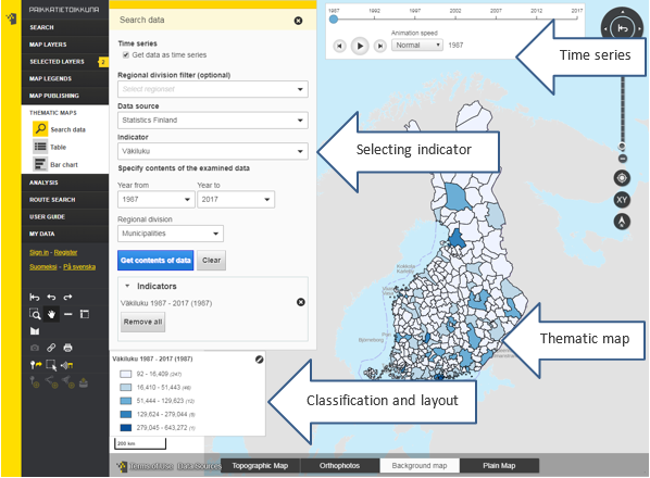
Figure 1. Functions for thematic maps
Dataset search
Before making selections regarding other indicators, you can choose whether you want to examine the indicator as a time series or as single years. The Time series function enables the study of the indicator as an animation of the time period you have selected.
To make a thematic map, you need to select an indicator to be used as the foundation for the thematic map. Define the following selections on the basis of which the indicator is searched:
- Regional division filter (optional): Select the regional division that you want to use to study the indicator. If you filter the data at this stage, you cannot select data sources or indicators that have no data in this regional division. You can search for regional divisions either by typing a search word in the text field or by selecting them in the drop-down menu. You can select several regional divisions by clicking the box in front of the name to turn the selection green. You can delete a selection by clicking the green box again. Accept the selections by clicking the OK button or cancel them by clicking the Cancel button.
- Data source: Select the data source of the dataset. Currently, you can select the Sotkanet, Official purchase price register, Statistics Finland, City of Helsinki and Your indicators.
- Indicator: Select the indicator you want to study. You can search for indicators either by typing a search word in the text field or by selecting them in the drop-down menu. You can select several indicators by clicking the box in front of the name of the indicator to turn the selection green. You can delete a selection by clicking the green box again.
When you have selected the indicators, click the OK button below the drop-down menu. If you want to cancel your selections, click the Cancel button. Please note that if you open the indicator menu again, clicking Cancel only cancels the selections made the last time.
When you have selected the data source and one or more indicators, specified selections open in the window. The selections apply to all indicators that you selected at the same time. If you want different specified selections for the indicators, you should select the indicators one by one.
After the selections, click the Get contents of data button to fetch the indicator data up for examination.
By clicking the Clear button, you can clear all selections from the data search. Please note that this will not remove selected indicators from the table, bar chart or map after they have been fetched.
In the Indicator drop-down menu, you can see the selected indicators as a list. Here you can remove indicators either one by one by clicking the cross following the indicator name or all by clicking the Remove all button below the list of indicators. After this, the indicators are removed from the table, bar chart and map.
Table
The table contains the data of the selected indicators according to the selected regional division. The following columns are shown:
- Areal division: You can change the regional division by clicking the drop-down menu below the header Areal division. If you change the regional division in the table, the regional division is also changed in the bar chart and map, respectively. You can also sort the areas in ascending or descending order.
- Searched data: You can sort the indicator values in ascending or descending order.
If you have fetched more than three indicators, they are spread over several pages. You can browse the indicators by clicking the arrow to the left or right of the Searched data header.
You can close and open the table window by clicking the Table symbol below the Thematic maps menu in the side bar on the left. You can close the window also by clicking the cross in the upper right-hand corner of the table window. You can remove fetched indicators by clicking the cross following the indicator name in the table. Then they also are removed completely from the map and the bar chart.
Bar chart
The bar chart shows the data of the selected indicators according to the selected regional division. If you change the areal division in the table window, the areal division is changed for the indicator in the bar chart as well. You can change indicator in the bar chart by clicking the drop-down menu below the Bar chart header.
You can change the order of the values shown in the bar chart by clicking the Order drop-down menu. You have the following options: Value ascending, Value descending, Name ascending and Name descending.
You can close and open the bar chart window by clicking the Bar chart symbol below the Thematic maps menu in the side bar on the left.
Classification and colors
When you have fetched the first indicator to be examined, a classification window opens automatically in the map window. The indicator presented on the thematic map is shown first in the drop-down menu of the classification window. If the indicator name does not fit in the text field, you can see the entire name by moving the cursor above the drop-down menu. In the drop-down menu, you can change the indicator to be presented on the map. You can drag the classification window to the desired location on the screen.
You can edit the classification by clicking the pen symbol in the upper right corner of the window.
You can select choropleth map or point symbol map as map style.
- On a choropleth map you can study the data of the dataset based on the selected regional division.
- A point symbol map uses point symbols to depict a location, quality or quantity of a phenomenon.
There are four different classification methods:
- Natural intervals: The division into classes is based on natural boundaries.
- Quantiles: There is an equal number of areas in each class.
- Equal intervals: The class intervals are equal in width.
- Manual classification: You can choose the class breaks yourself. If you select Manual classification, a Modify classification button appears in the window. By clicking this button you can define the class breaks.
The class break that is being edited is shown in yellow. You can change the values either by dragging the limits or by typing the desired value in the text field. When you are done, click the Save button. If you do not want to save the changes you have done in the classification, click the Close button.
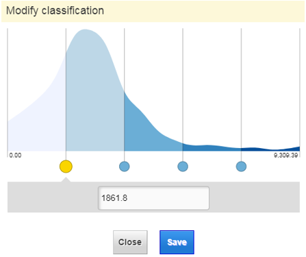
The division into classes makes it possible to change the number of classes.
Class breaks can be presented either as continuous or discontinuous. Discontinuous class breaks delimit classes according to real values, whereas continuous class breaks delimit classes so that classes continue from class to class. Let us the following values as an example: {1.1; 2.3; 4.5; 5.6; 7.2; 8.3; 10.0}. The values are divided according to natural intervals into three classes. The continuous classes would be {”1.1–2.3”; ”2.4–5.6”; ”5.7–10.0”}. The discontinuous classes would be {”1.1–2.3”; ”4.5–5.6”; ”7.2–10.0”}.
By clicking Show values, you make indicator values visible on the map.
The color distribution of a choropleth map can be quantitative, qualitative or diverging. For each color distribution, you can choose between several different color schemes.
You can choose between the following distributions:
- Quantitative: A quantitative color distribution is used when the selected indicator is quantitative, i.e. depicts a numeric characteristic of the object. Such characteristics are e.g. age, height and percentage value. The darker the shade of an object is, the higher the value of the indicator is there. The colors of classes depicting e.g. percentage values could be white (0–25), yellow (26–50), orange (51–75) and red (76–100).
- Qualitative: A qualitative color distribution is used when the selected indicator is qualitative, i.e. depicts a non-numeric characteristic of the object. Such characteristics are e.g. color, nationality and region. Each class has its own color. When depicting e.g. regions, the colors could be blue (Uusimaa), red (Ostrobothnia) and yellow (Southwest Finland).
- Diverging: A diverging color distribution is used when the selected indicator is relative and depicts e.g. change or difference from zero. Such characteristics are e.g. temperature, change in population and height above sea level (if depth data is included). The color alters according to whether the indicator value is negative (lower than zero) or positive (higher than zero). The colors of e.g. temperatures could be dark blue (-5–-10), light blue (-5–0), white (0), light red (0–5) and red (5–10).
You can flip the colors by clicking Flip colors.
On a point symbol map, you can select one color at a time.
You can also define the point size. By changing the minimum and maximum point size you can optimize how well points differ from each other taking into account the characteristics of your dataset.
You can select a transparency of 30–100 per cent for the points.
For point symbol maps and choropleth maps you can select the number of decimals to be shown.